How to Configure Catalog Views and Menus by Device Type
Provide your users with the smoothest possible experience by configuring views and menu options for the type of device they are using. This makes the views look great and makes only the views relevant on that device accessible.
For example:
- Configure the layout of the catalog view differently for phones, tablets and web browsers
- Configure the menu to offer views relevant for that device type only (Lines view only for phones, vs Med/Small/Grid for tablet or web)
- Configure views for landscape differently than portrait
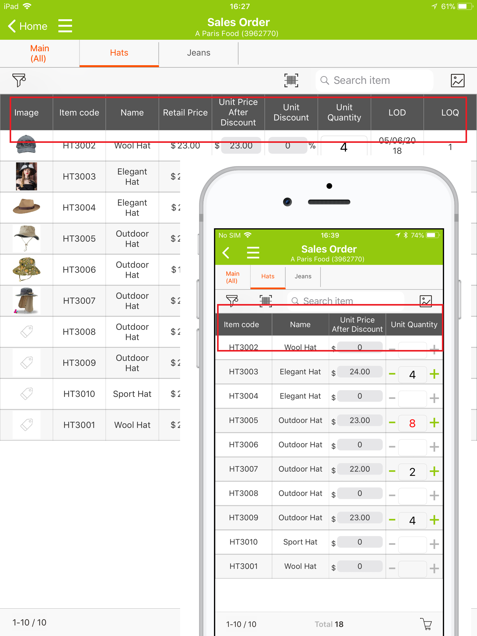
Here you can see a grid line view configured for tablets and phones. The phone configuration of the Grid View has less columns (although scrolling is unlimited and you can have as many columns as in the tablet view as well).
To configure views by device use the "+" sign on the profile you wish to configure (Rep, Admin, other):
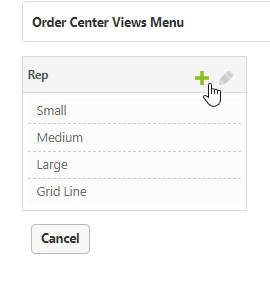
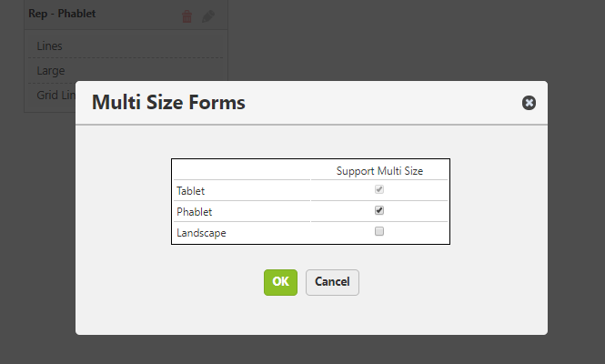
Select the device type you wish the view to be configured for:
Tablet - any tablet device (ie iPad, Android tablet, etc)
Phablet - any mobile phone device (ie iPhone, Android phone)
Landscape - refers to any larger screen such as browser on a desktop in full screen size, and tablet rotated to landscape mode. (NOTE: Landscape rotation is not supported for mobile phones, therefore rotating a mobile phone to landscape results in the same configuration as tablet Portrait)
|
Screen size (inches) |
Rotation |
Screen definition |
|
<5.5 |
Portrait |
Phablet |
|
Landscape |
Phablet |
|
|
5.5 – 7.5 |
Portrait |
Phablet |
|
Landscape |
Tablet |
|
|
7.6 – 9.4 |
Portrait |
Tablet |
|
Landscape |
Tablet |
|
|
>9.4 |
Portrait |
Tablet |
|
Landscape |
Landscape |
The multi size forms you indicated for the profile will appear as separate configuration forms.
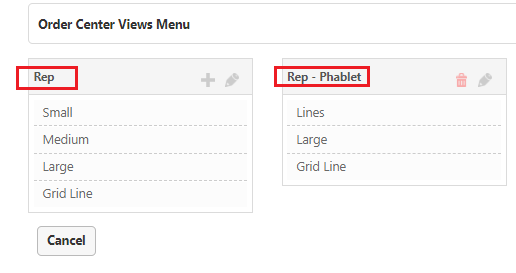
Enter each form and configure it as you wish for that device type.
0 comments
Please sign in to leave a comment.